Note: this is an adaptation of a post from a social media platform, with minor edits for grammar and context.
User deetvleet asked:
i love the colours in your artwork! how do you choose them?
Thank you! Colours are one of my favourite things to experiment with and so I’ve ended up with a relatively streamlined process.
I usually begin with a palette of 96 colours called springboard-96. I made this palette myself as a starting point for mixing new colours as I develop the art piece. Below is a sample of the palette.
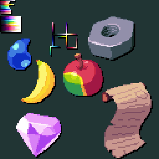
As an aside, I meant to make a 256-colour "extended" version of it but I never got around to it.
springboard-96 is an edit of an edit of an existing palette called Journey by PineappleOnPizza. In its current state, springboard-96 encapsulates my use of colour fairly well. Some notable features:
- The greyscale ramp hueshifts from purple to green. I like this because it gives the darker greys a more grimey feel. It works especially well for drawing metal.
- Red has a unique hueshifting pattern. Initially it shifts towards pink as it gets darker, but after a point it starts getting warmer again. I like doing this because it accentuates the pinkness of the main shade and creates a nice balance of warmth and coolness within the colour ramp
- There's two green ramps. I like green.
When it comes to rendering objects and characters I usually pick 3 tones for each material: a main tone, a shade tone, and a line tone. I avoid making these 3 tones a perfect linear ramp if possible. I like to change the hue or saturation of the line tone so the shade tone isn't directly inbetween the main tone and line tone, if that makes sense. Sometimes I will also move the shade tone closer to the line tone.
For example, we'll look at Ocha's hair:
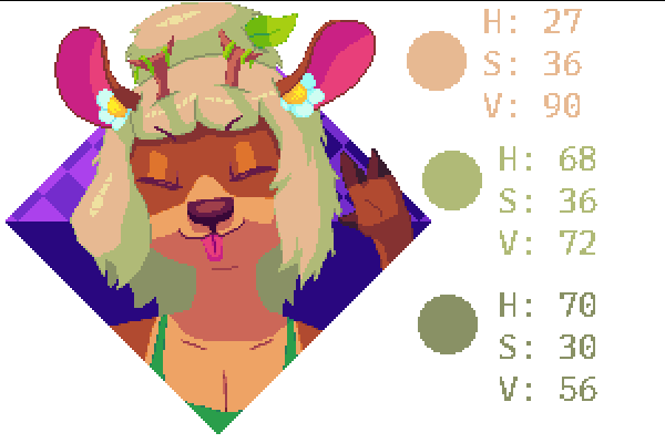
I've listed the hue, saturation, and value of 3 of the 4 tones her hair uses. You can see the hue of the shade tone is a lot closer to the line tone, while the saturation is closer to the main tone. "Biasing" the hue or saturation like this can help to make each colour stand out while fitting nicely in a ramp (generally keeping value linear is best, but anything can work).
Additionally, playing around with "non-standard" huestifting can be very rewarding. Usually you're told that light tones should shift towards warmer hues and dark tones should shift towards colder hues but switching it up can produce interesting results. In Ocha's hair, the hue shifts from yellow to green, which gives it a nice natural or earthy feel when combined with the low saturation. The highlight also shifts towards green which helps to emphasis the general green-ness of her hair while letting the beige prevent it from becoming overpowering. Additionally, the main tone is pulled from springboard-96 so that's an example of how I use the palette to mix new colours.
Overall, the most important things to my process are to mix new colours as I need them and to be Weird with colour usage. In the spirit of minimalism I generally try to use as few unique colours as possible, so finding a balance between that and mixing new colours as I need them can be a fun challenge as well. Thank you very much for the ask!
Terminology
- Ramp/colour ramp
- A gradient, or series of colours, formed by blending a colour from light to dark.
- Hue
- Commonly referred to as "colour". In this article I use the word "colour" to refer to a specific combination of hue, saturation, and value. Red, green, and blue are examples of distinct hues.
- Saturation
- The vibrancy of a colour. Lowering saturation makes colours appear more grey or washed out.
- Value
- The brightness of a colour. Lowering saturation makes colours appear darker.
- Hueshifting
- A technique in which the artist changes the hue of a colour slightly as the brightness of the colour increases or decreases.
- Palette
- A selection of colours for use in art.